SAKURA TRAVELS
THE BRIEF
The brief was to showcase my knowledge of HTML and CSS to create a multi-layered website.
THE SOLUTION
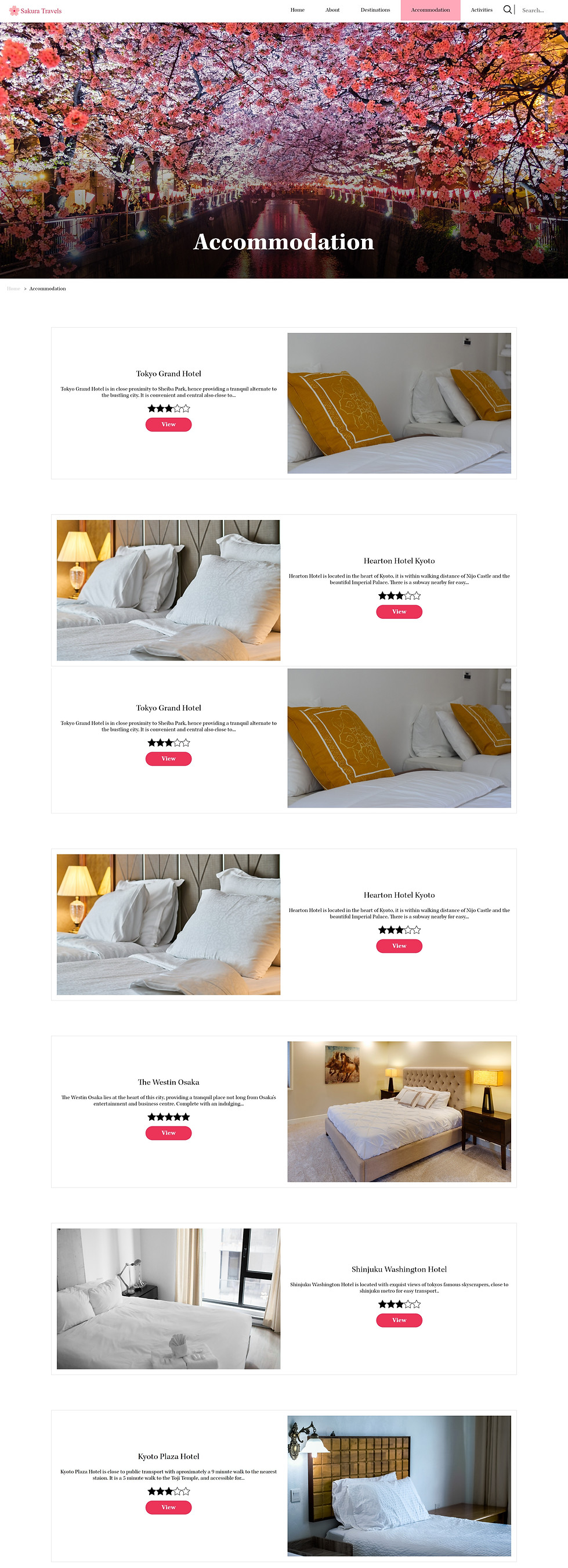
Sakura Travels is a Japan travel website that I designed, with an intuitive interface to give users an insight into nine popular destinations to visit in Japan. It is a beginner's guide to get them started on planning their trip inclusive of accommodation and sites to see.
Behind the scenes, the interface is designed to be simple and easy to navigate with a breadcrumb trail to guide the users through the site so they do not lose track of their location.
COMPUTER INTERFACE EXAMPLE

SKILLS REQUIRED


PERSONAS
Personas were generated to guide the design outcome. Enabling me to explore the user groups and think creatively about what they need and want from the website.

INFORMATIVE
INTUITIVE
COHESIVE
Cohesive Delivery of Travel Infromation
Simple Interface
Breadcumb Navigation
Cohesive Design Aesthetic
Minimalist Design
THE DESIGN PROCESS
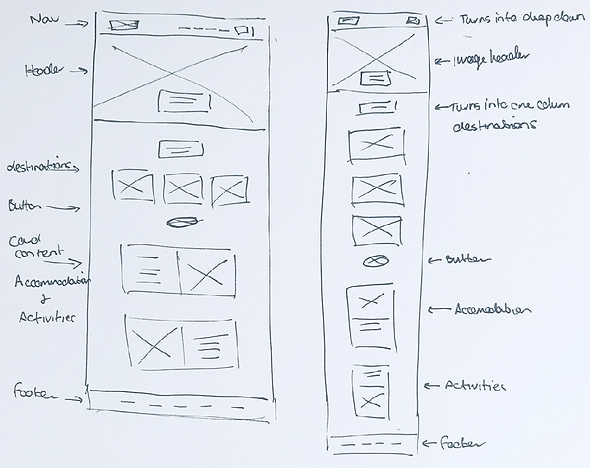
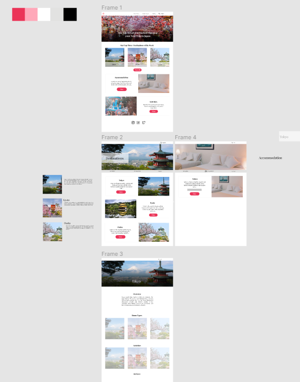
There are a few processes utilised before coding. Wireframing was my first tool to ideate the layout of the site, what content I wanted to include and the sub-pages that were required to achieve my design vision. After this I planned out the full layout using information architecture, giving me a clear understanding and visual representation of my website structure. Figma was the final tool to produce a high-fidelity mock-up before I started coding in brackets.
WIRFRAMES
INFO ARCHITECTURE

FIGMA MOCK-UP
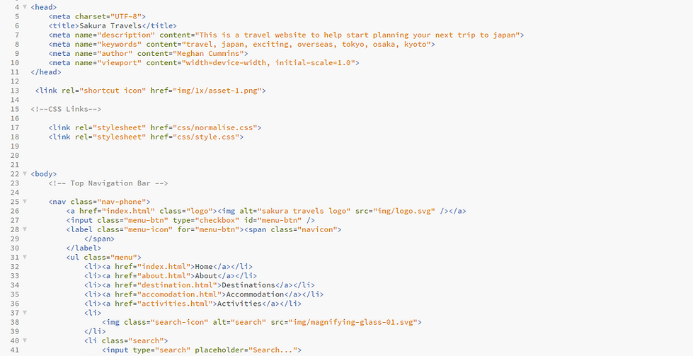
CODE
The code was written to be clean and structured increasing readability and ease of editing.
DESIGN AIMS
CLEAN & SIMPLE
Structure the content so it is easy to read and understand, having too much content can be information overload. This website needs to be simple, giving a basic understanding for first-time users to understand what Japan has to offer.
MINIMALIST
Ties in with the first aim, allowing the website to be clean, and increasing usability and user experience.
INCREASED READABILITY
Written content is designed to be easy to understand and interpret increasing user experience.
EASY NAVIGATION
Use breadcrumbs to assist users in navigating the website, so they know where they are at all times. Also, make sure the navigation has clearly labelled sections, so users know exactly where to find the content they need. Make links available in the header and footer so the user can navigate from any point down the page. Increasing their interaction with the website.
CONSISTENT
Having consistent layouts and styles assists in making the website neat and structured.
MULTI-PLATFORM
I coded Sakura Travels to be responsive so it is suitable for both web browsers on a computer and phone.
APP INTERFACE EXAMPLES


COMPUTER INTERFACE EXAMPLE